
CSS Grid auto-fit 與 auto-fill 差在哪?空欄、卡片拉伸與最後一列
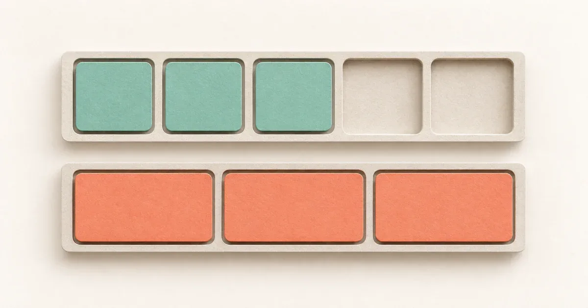
同樣寫 repeat(..., minmax(180px, 1fr)),只有兩張卡片時,auto-fit 會把卡片撐寬,auto-fill 則可能留下空欄。選擇的關鍵是:容器放得下更多欄、資料卻不足時,是否保留那些欄位。 若每個欄軌已被某一列的卡片占用,兩者可能看起來一樣。
這也回答一個常見誤會:auto-fit 不保證讓最後一列的少數卡片各自分滿整行。Grid 的欄軌跨列共用,判斷的是整個欄軌有沒有項目,不只看最後一列。
兩張卡片時,空欄決定剩餘寬度怎麼分
CSS Grid 規格與 MDN repeat()說明:auto-fit 先依 auto-fill 的方式排出重複欄軌,放置項目後,再收合沒有 in-flow 項目占用或跨越的欄軌;收合欄軌與相關間距不再占原本的寬度。
以寬 800px、gap 16px、每欄最小 180px 為例,可以排四欄。只有兩張普通、依序放置的卡片時:
auto-fill保留四欄,兩張卡片各約188px。auto-fit收合兩個空欄,兩張卡片各約392px。
維護流程於 2026-11-02 在 macOS Chrome 執行下方 HTML:800px 容器下,兩張卡片分別量到 188px 與 392px;五張卡片在兩種模式皆為 188px。其他環境可能依子像素取整呈現小差異。實際專案還要確認 padding、border、欄跨距與內容限制,不能把 188px 當成所有容器的固定值。
用同一組內容比較,別一次改三個條件
以下完整 HTML 包含兩張與五張卡片的兩種模式。存成 grid-demo.html 後以瀏覽器開啟,使用按鈕切換容器寬度;也可用 DevTools 檢查欄軌。
<!doctype html><html lang="zh-Hant"><meta charset="utf-8"><meta name="viewport" content="width=device-width,initial-scale=1"><title>auto-fit 與 auto-fill 欄軌比較</title><style>* { box-sizing: border-box; }body { margin: 24px; font: 16px/1.6 system-ui; background: #faf8f3; color: #243942; }.demo { width: 800px; max-width: 100%; display: grid; gap: 16px; margin-block: 16px 32px; background: #e5e7e9; }.fill { grid-template-columns: repeat(auto-fill, minmax(min(100%, 180px), 1fr)); }.fit { grid-template-columns: repeat(auto-fit, minmax(min(100%, 180px), 1fr)); }.card { min-width: 0; padding: 16px; background: #cce5dc; overflow-wrap: anywhere; }.fit .card { background: #f1c2ad; }</style><h1>空欄與最後一列是兩個問題</h1><p>將視窗縮窄,或用 DevTools 檢查 grid-template-columns 與卡片寬度。</p><button type="button" onclick="document.querySelectorAll('.demo').forEach(el => el.style.width = '800px')">容器 800px</button><button type="button" onclick="document.querySelectorAll('.demo').forEach(el => el.style.width = '160px')">容器 160px</button><h2>auto-fill:兩張卡片</h2><section id="fill-two" class="demo fill" aria-label="auto-fill 兩張卡片"><article class="card">卡片 A</article><article class="card">卡片 B</article></section><h2>auto-fit:兩張卡片</h2><section id="fit-two" class="demo fit" aria-label="auto-fit 兩張卡片"><article class="card">卡片 A</article><article class="card">卡片 B</article></section><h2>auto-fill:五張卡片</h2><section id="fill-five" class="demo fill" aria-label="auto-fill 五張卡片"><article class="card">卡片 A</article><article class="card">卡片 B</article><article class="card">卡片 C</article><article class="card">卡片 D</article><article class="card">卡片 E</article></section><h2>auto-fit:五張卡片</h2><section id="fit-five" class="demo fit" aria-label="auto-fit 五張卡片"><article class="card">卡片 A</article><article class="card">卡片 B</article><article class="card">卡片 C</article><article class="card">卡片 D</article><article class="card">卡片 E</article></section></html>min(100%, 180px) 讓最小欄寬在容器小於 180px 時可隨容器縮小;外層仍需有可解析的寬度。它處理欄軌的下限,長文字、圖片或卡片內部固定寬度仍需另外處理。若是兩欄版面被長內容撐開,請看 minmax(0, 1fr) 與 min-width: 0,那是不同的除錯問題。
五張卡片時,最後一張為何沒有拉滿?
容器能排四欄、共有五張卡片時,第一列已占用全部四個欄軌。第二列只有一張卡片,並不會讓其餘三個欄軌變成「空欄軌」,所以 auto-fit 不會收合它們。第五張卡片仍拿第一欄的寬度。
若設計要求每一列都獨立均分,應評估 Flexbox 的換行與 grow 契約,或明確指定項目跨欄;不要期待換成 auto-fit 就得到逐列重排。跨欄之後也需重新檢查排列順序與窄版面,不能只補一個 grid-column 就忽略其他資料量。
驗收時固定寬度,再改資料量
先在 800px 比較範例的兩張卡片與五張卡片,使用 DevTools Grid overlay 和 computed grid-template-columns 看空欄是否收合,再量測卡片實際寬度。接著把容器設為 160px,確認卡片縮至單欄、頁面沒有因 180px 下限而水平溢位。
本次切換至 160px 容器後,四組範例皆為單欄,容器 scrollWidth 與寬度均為 160px;頁面 scrollWidth 與 clientWidth 均為 1470px。這只驗證隨文範例,沒有驗證其他瀏覽器或實際產品資料。
最後以實際資料檢查零筆、一筆、剛好一列和多一筆;若有 skeleton 或隱藏項目,也要注意它們是否仍參與 Grid 排版。商品目錄需要少量資料仍維持卡片密度,可選 auto-fill;少量卡片應填滿可用寬度,可選 auto-fit。兩者都不替卡片內容決定適合的最大閱讀寬度。
參考資料: